Flight Quotation Builder
Overview
Our quotation application allows the private jet charter salespeople to quickly generate accurate and branded quotes. Creating an itinerary per client’s request is the first and most important step of the process. In this case study, I will focus on how I fixed the usability issues of our previous itinerary builder in our quotation application.
My Role
Primary designer collaborating with a product manager and team of 6 engineers to execute and deliver on the product. I was responsible for executing on all stages of the product design process. This included research, best practices, wireframes, testing, and high-fidelity artifacts.

Background
The itinerary builder didn't work the way people worked
After getting a quote request from the client, the first thing the salesperson does is build out the trip itinerary and make necessary changes to the trip so that the client’s needs are satisfied related to pricing, crew & aircraft availability, feasibility, and safety. This is one of the primary reasons that quoting is a manual process today.
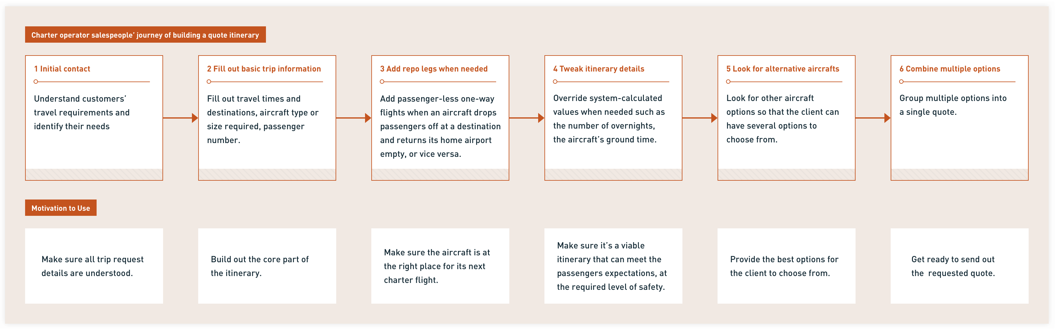
↑ Understand the workflow of building an itinerary as well as the users' motives
Our previous itinerary builder was modern-looking and incorporated white space in all of the usual places—around headers, content blocks, and in table rows. However, the users were complaining about the productivity loss:

↑ User complaining about the previous itinerary builder
When I first joined the team, I was leading the design iterations to address those issues (some of the iterations are shown below). We did shrink the font sizes which helped, but there were still some issues on low resolution displays. With more complex requirements and more complaints coming in, we knew small adjustments would not suffice anymore and that it was time to rip off the bandage and fix the problems.

↑ The original itinerary builder

↑ Surface the critical information and actions upfront

↑ Allow editing the itinerary data at a more granular level

↑ Allow editing the flight leg attributes
The Problem
Identity the main pain points
The first thing I did was to go through the user feedback we collected when talking to our users and when the CS team was running demos, onboarding new users, and responding to complaints. Here were the 3 main pain points summarized using the affinity map:
- The density of information was way less than what they were used to. There was too much scrolling and lots of wasted space. It was annoying to scroll all over the place to answer questions when talking to their clients.
- Difficulty in accessing key itinerary data.
- Difficulty in fine-tuing the values. It was oversimplified.
User needs
Simon(our persona), a busy charter salesperson, needs to quickly and confidently build out an accurate trip itinerary in order to create a viable quote that meets his client's expectations, at the required level of safety.
My Approaches
Structure the content and create a scalable framework
I started by sorting out all the essential info that Simon needs to build an accurate and feasible quote. In order to fit all the essential information and accommodate more complex scenarios down the road, I introduced a multi-column responsive structure(as shown below) to:
- help the users quickly review all the information they need with very minimal scrolling.
- allow the users to easily manipulate frequently-used fields.

↑ A responsive framework
The framework didn’t get into the level of detail you’d find in a typical wireframe or mockup. Its sole purpose was to provide a coherent way of assembling the spaces that fulfill the essential purpose of this particular screen—specifically, a way to access and edit all essential data easily in the itinerary builder.
- 1- Leg* level configuration and leg level info such as the leg number and warnings.
- 2- Main content area which groups related editable information in a logical way. I also decided to leverage our “expand/collapse” pattern in our design system to balance the information density and easy access to data.
- 3- Leg level actions such as adding a leg before or after.
- 4- Quick access to add a new leg or cancel a leg.
*A flight leg is a direct flight from point A to point B with no stops or changes of aircraft along the way
Translate the framework to interfaces
Our design system was quite mature and enabled us to explore & prototype with real parts of the UI quite fast.
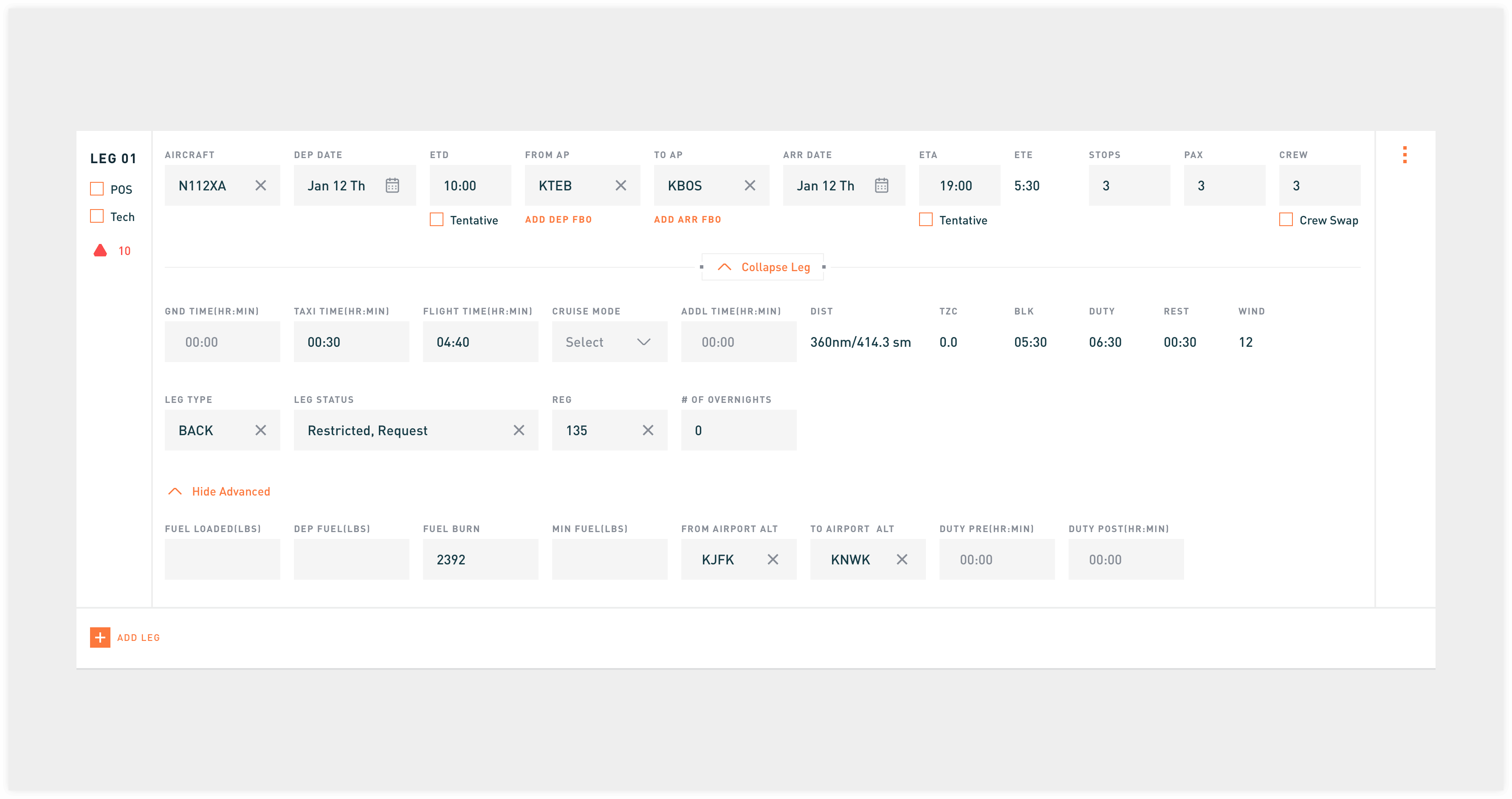
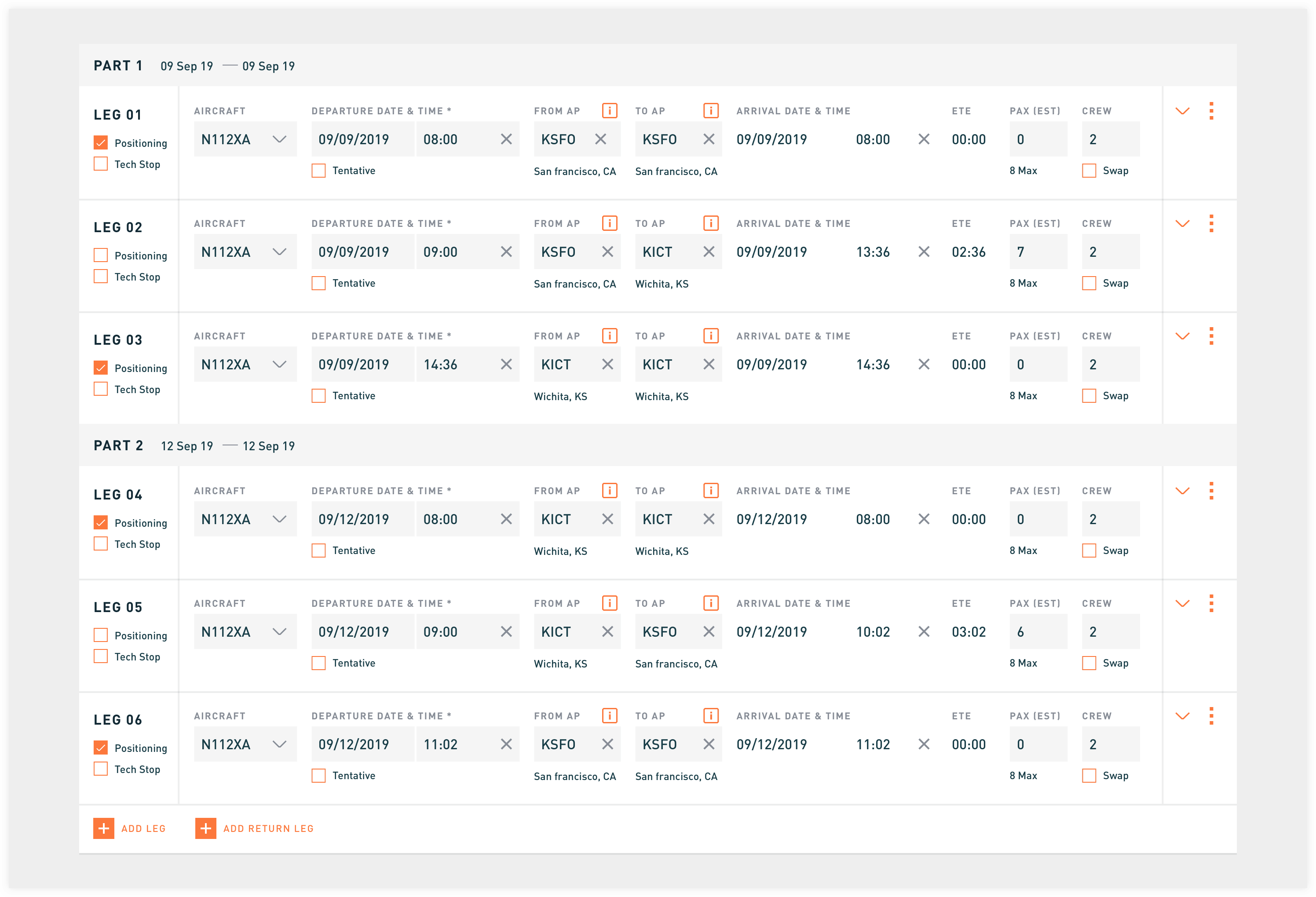
↑ Expanded leg. The user can access all the data
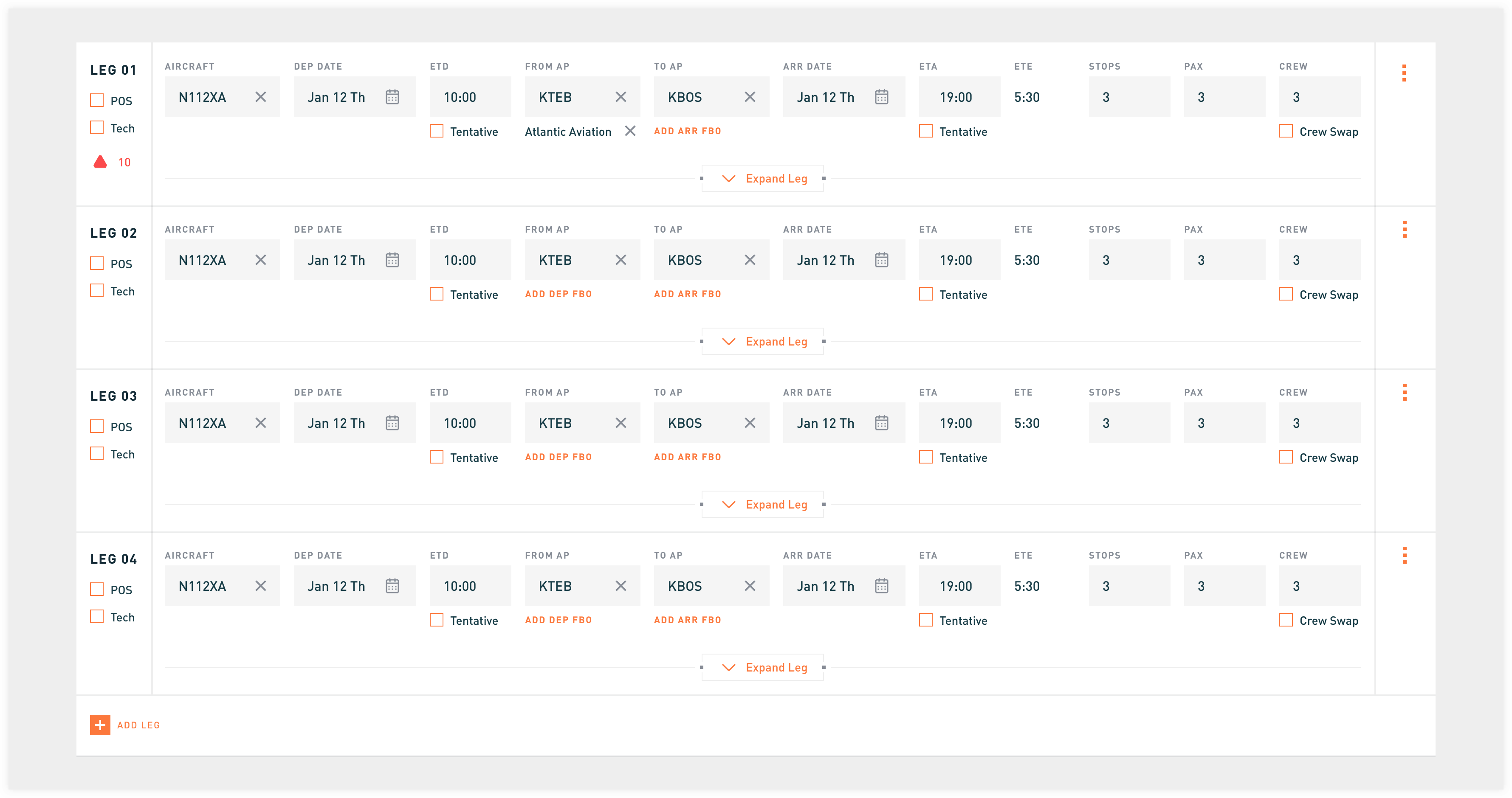
↑ Collapsed leg. The user can view 4 legs at one time
We showed the updated itinerary builder within the revamped quoting workflow to 2 customers and performed a hallway testing when we were attending one of the industry conferences. Our existing and potential users liked how straightforward and easy it was to navigate and edit the itinerary. I then refined it to further maximize the screen real estate. For example, I got feedback that the fields in the "Advanced" accordion were rarely used so I removed the nested accordion entirely.
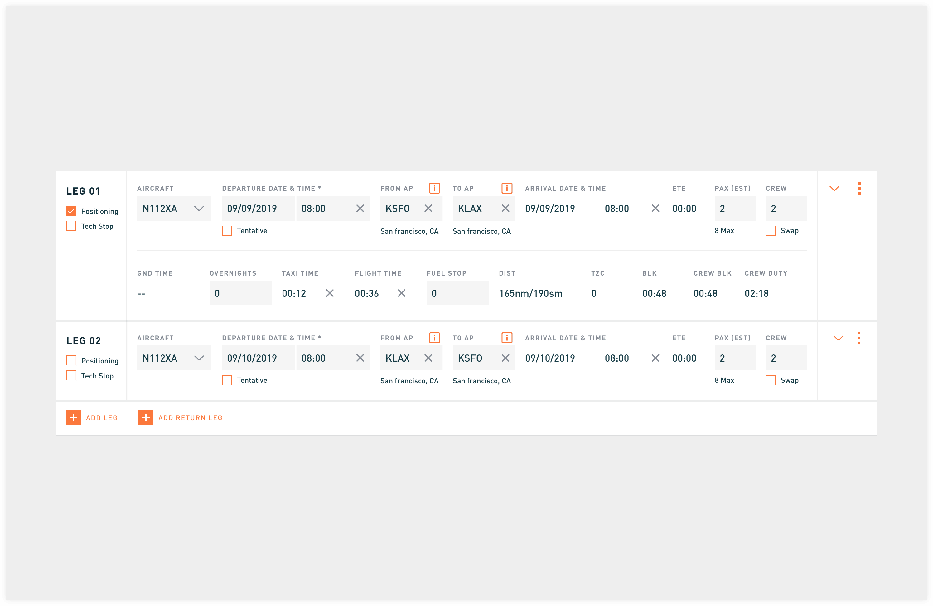
↑ Finalized itinerary builder
↑ More scalable structure than the previous table UI
Refined the Interaction Details
Interaction with system-calculated Values
There are some field values generated automatically by the system that the user doesn't need to change very often but still need to be editable.
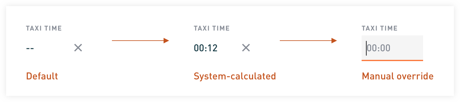
↑ Example of overriding system-calculated value
Faster way to select the correct aircraft
There was a ton of detail we could go into for even the simplest components such as a dropdown. For example, I updated the aircraft dropdown to include more relevant information such as the aircraft homebase. I had learned from our users that for large operators with multiple bases, this was one of the key pieces of missing information that slowed them down when deciding which aircraft to pick.
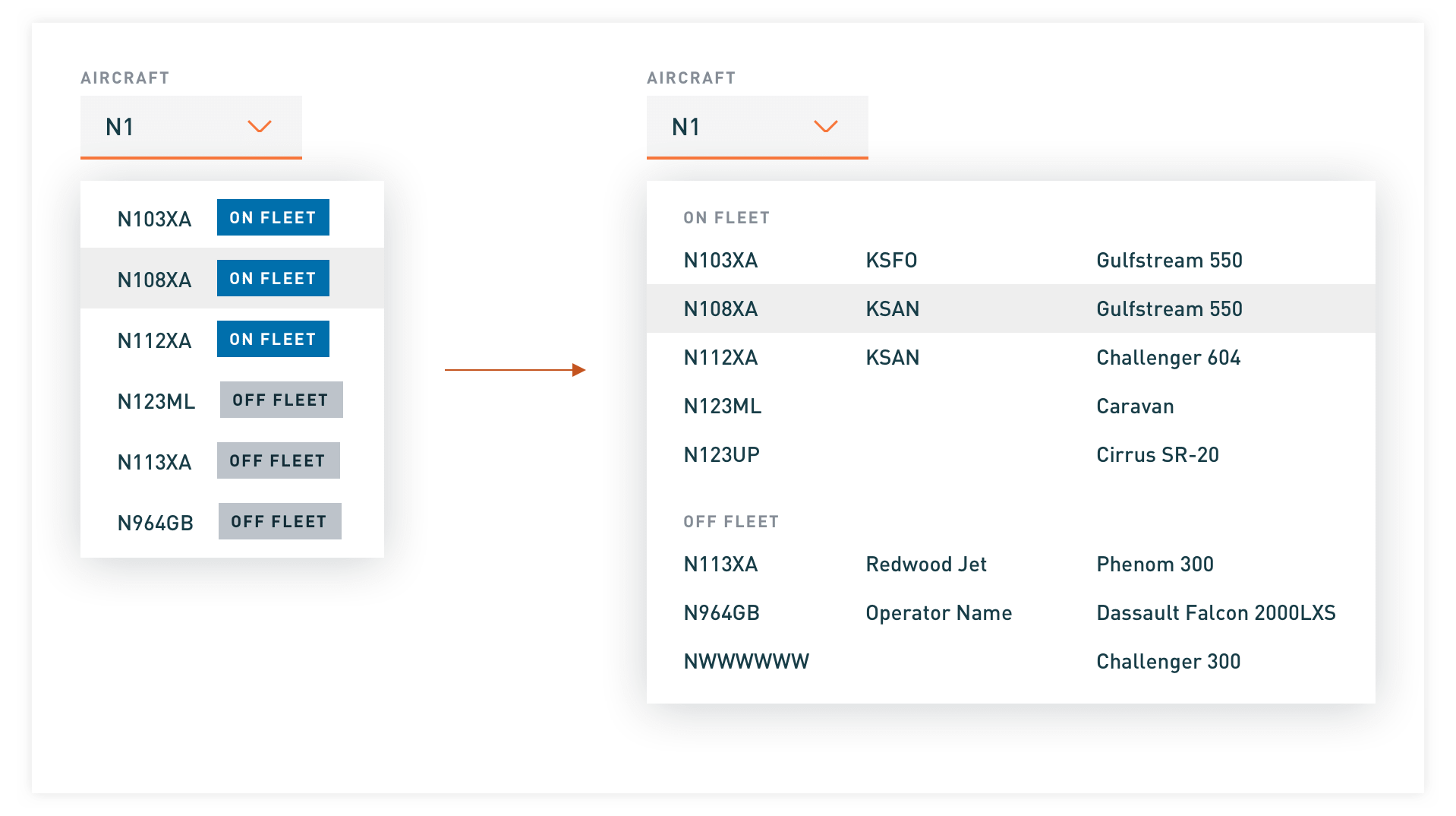
↑ Aircraft dropdown iteration
Keyboard navigation for improved accessibility
- The users can build out an itinerary using just the keyboard. They can use the Tab key to navigate through all the interactive elements in a logical order.
- We are using the browser's default focus indicator. We realized that some browsers don’t do a good enough job for this to be relied upon such as Safari, but we decided to leave it as is since only 1% of the users are using Safari.
Reflections
I've learned overtime that oversimplifying the enterprise software will prevent professionals from doing their daily job. The product shouldn't force users into fixed user journeys either. The workflow needs to be flexible. Check out how the itinerary builder is used in the quoting process:
View more details